 how-to
Best Practices for Logo Placement on Uniforms
Table of Contents
- Why Logo Placement Decides Whether Your Uniform Looks Professional
- The Five Standard Logo Positions on a Uniform Shirt
- Left Chest Logo Placement: The Professional Default
- How to Choose the Right Uniform Logo Size
- Polo Shirt Logo Placement: Collar, Placket, and Chest Rules
- Logo Placement on Workwear: Safety, Visibility, and Function
- A Measurement and Approval Workflow Before Production
- Step 1: Confirm the Garment and the Full Size Range
- Step 2: Set the Reference Points on a Physical Sample
- Step 3: Measure the Placement
- Step 4: Produce a Placement Mockup
- Step 5: Get Written Approval
- Step 6: Run One Sample
- Step 7: Release the Full Run
- Inclusive Sizing and Fit Variation
- Artwork Files and Production Constraints
- Coordinating Placement Across a Full Uniform Program
- Conclusion
- Frequently Asked Questions
Last Updated: October 13, 2026
Why Logo Placement Decides Whether Your Uniform Looks Professional
Logo placement is where your company mark is printed or embroidered on a garment, measured from a fixed reference point like the collar or shoulder seam.
At Logo Concepts & Printing, we have spent more than 25 years decorating apparel for banks, car dealers, construction crews, and investment firms.
Below, we break down the five standard positions, exact sizes, and a measurement workflow you can hand to any decorator.
The Five Standard Logo Positions on a Uniform Shirt
Nearly every decorated uniform uses one of five positions: left chest, right chest, center chest, sleeve, or upper back. Here is how they compare:
| Position | Typical Size | Best For | Visibility |
|---|---|---|---|
| Left chest | 3-4 in wide | Daily uniforms, polos | High, close range |
| Right chest | 3-4 in wide | Paired marks, name badges | Medium |
| Center chest | 8-10 in wide | Event shirts, retail staff | High, wide range |
| Sleeve | 2-3 in wide | Secondary marks, slogans | Medium |
| Upper back | 8-12 in wide | Job sites, large venues | Highest at distance |
Left Chest, Right Chest, and Center Chest
The left chest is the default: it sits in the natural sightline of anyone shaking hands and stays readable under a jacket or lanyard.
Right chest works best as a companion mark, a company logo on one side, a certification, department name, or employee name on the other.
Center chest suits shirts worn in crowds, since the mark stays visible from a distance.
Sleeve and Upper Back Placement
Sleeve placement carries secondary marks: a slogan, a URL, or a small icon. Keep it on the wearer's left sleeve for consistency.
Upper back placement, often called the yoke area, is where large marks live, job sites, races, and anywhere people see your team from behind more than face to face.
Left Chest Logo Placement: The Professional Default
Left chest logo placement is the standard for company uniforms because it reads as intentional, stays visible with outerwear, and matches buyer expectations. If you only decorate one spot, make it this one.
Positioning rules to consider:
- Measure from the shoulder seam down 7 to 8 inches for most adult shirts
- Center the mark 3 to 4 inches from the button placket
- Keep the top of the logo about 1 inch below the collar seam
How to Choose the Right Uniform Logo Size
Uniform logo size depends on garment type and mark shape. A left chest logo usually runs 3 to 4 inches wide; a full back print can run 10 to 12 inches. Size rules that hold up in production:
- Left chest: 3 to 4 inches wide, 1 to 1.5 inches tall
- Sleeve: 2 to 3 inches wide
- Center chest: 8 to 10 inches wide
A wide, flat logo scales down better than a tall, square one. If your mark is stacked, reduce the height first and keep the width consistent.
Polo Shirt Logo Placement: Collar, Placket, and Chest Rules
Polo shirt logo placement follows the same left chest logic as other tops, but the collar and placket change the math. The placket, the reinforced strip holding the buttons, gives you a fixed vertical line to measure against.
For polos:
- Place the mark 7 to 8 inches below the shoulder seam
- Keep it 3 to 4 inches from the placket edge
- Leave at least 1 inch of clear space below the collar
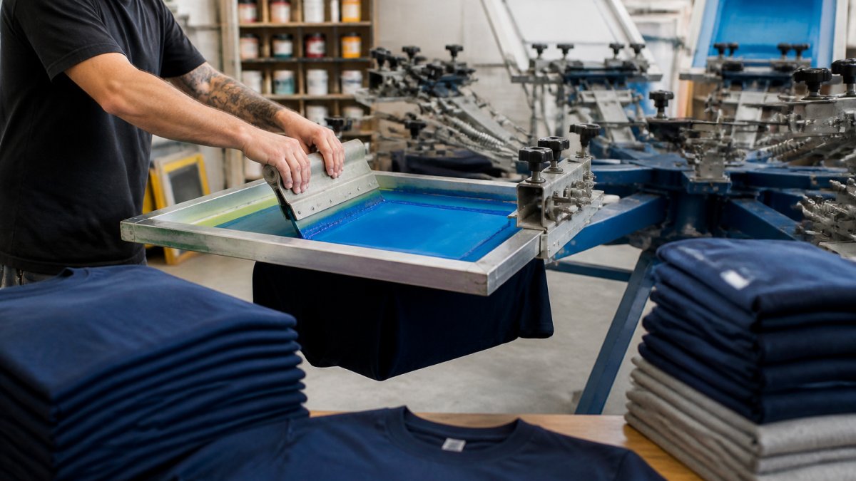
Embroidery is the most common decoration for polos because the stitch holds up to repeated washing. Screen printing and heat transfer suit flat, smooth fabrics better.
Logo Placement on Workwear: Safety, Visibility, and Function
Logo placement on workwear has to clear a higher bar than a polo.
Start by identifying what the garment is certified to do. High-visibility apparel is typically rated under ANSI/ISEA 107, which sets minimum visible areas of background and retroreflective material.
Practical constraints to consider for workwear orders:
- Never place a mark over reflective tape, striping, or a trim band, covering retroreflective material reduces the visible area the garment was certified to provide.
- Keep logos off high-friction areas like elbows, knees, waistbands, and shoulder tops where harness straps and tool belts ride.
- On FR garments, use only decoration methods and materials approved for that fabric. Standard embroidery thread and plastisol ink can compromise FR performance unless the supplier confirms they are rated for it.
For construction and industrial clients, we often recommend a left chest mark plus an upper back mark: the chest mark handles close conversations, the back mark handles the job site.
Matching Placement to the Job, Not Just the Garment
The same company can need different placement rules for different crews.
- Industrial and construction: left chest plus upper back, both clear of reflective trim and harness contact points.
- Healthcare: left chest only on scrubs and lab coats, kept small enough to stay clear of badge reels and stethoscope contact.
- Food service: left chest on shirts, and on aprons keep the mark above the waist tie so it is not covered when the apron is cinched.
A useful rule: place the mark where the wearer's job keeps it visible, not where a flat lay photo makes it look best.
Visibility, Reflective Materials, and Comfort Trade-offs
Visibility and comfort pull in opposite directions on workwear.
A left chest mark in the 3 to 4 inch range plus a back mark in the 8 to 12 inch range can cover close and distance visibility without significantly affecting wearability.
If a client needs both a large back mark and reflective trim, the back mark moves to the upper yoke, above the top reflective band, keeping the retroreflective area intact.
A Measurement and Approval Workflow Before Production
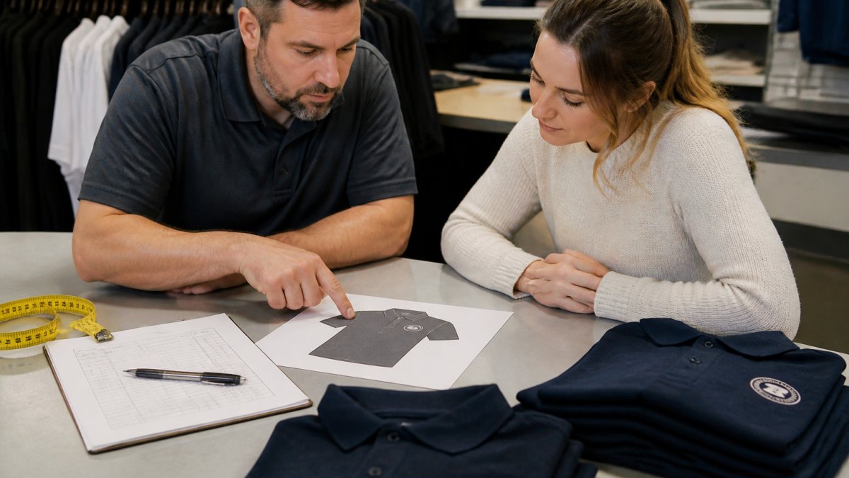
A measurement and approval workflow prevents wrong placement from reaching the press. It takes about 20 minutes per order and saves a full reprint.
Step 1: Confirm the Garment and the Full Size Range
List every size in the order, smallest to largest, and note the cut for each, men's, women's, unisex, petite, tall, or plus. Placement rules that hold on a men's medium can drift on a women's 2XL or a tall large because the pattern, placket width, and shoulder-to-chest distance all change.
Step 2: Set the Reference Points on a Physical Sample
Do not measure from a flat lay photo. Put a physical sample shirt on a table and mark these landmarks with tailor's chalk or removable tape:
- The shoulder seam where the sleeve meets the body
- The button placket edge
- The collar seam at the base of the neck
Every placement rule in this article measures from one of these four points.
Step 3: Measure the Placement
Apply the position rules to the sample:
- Left chest: 7 to 8 inches down from the shoulder seam, 3 to 4 inches from the placket edge, top of the logo about 1 inch below the collar seam.
- Sleeve: centered on the outer face of the sleeve, 2 to 3 inches wide, with the top of the mark roughly 1 inch below the shoulder seam.
- Upper back: centered between the shoulder seams, top of the mark 2 to 3 inches below the collar seam.
Measure the same points on the smallest and largest sizes and compare. If the mark drifts more than about 1/2 inch between sizes, adjust the rule for that cut before you approve anything.
Step 4: Produce a Placement Mockup
A placement mockup shows the logo on a photo or digital rendering of the actual garment, at the actual size and position. Ask for the smallest and largest sizes side by side, a mark that looks centered on a medium can sit visibly off on a 3XL.
Step 5: Get Written Approval
Have the client sign off on position, size, color, and decoration method. Written approval protects both sides if a dispute arises later; a simple email confirmation is enough.
Step 6: Run One Sample
Decorate a single shirt and check it against the mockup. Measure the finished mark, not the digital file, embroidery pulls fabric slightly and screen printing can shift a fraction of an inch.
Step 7: Release the Full Run
Only after the sample passes. If the sample fails, fix the placement rule and re-run the sample before releasing the order.
Inclusive Sizing and Fit Variation
Size grading is why a logo that looks centered on a small shirt can drift on a 3XL: patterns scale, and the shoulder-seam-to-chest distance grows with each size. The same problem shows up across petite, tall, and plus-size cuts, where placket width and shoulder slope change independently of overall size.
To handle fit variation across a full size range:
- Use a vector file (AI, EPS, or PDF) so the mark scales without blur.
- Convert all text to outlines before sending files.
- Ask your decorator to check placement on the smallest and largest sizes, and on any women's or plus-size cut in the order.
Artwork Files and Production Constraints
The placement you choose has to work with the artwork you have. Before approving a position, confirm the file meets the decorator's production requirements:
- Minimum line thickness: thin lines and small text can close up or disappear in embroidery. Text inside a logo generally needs to be at least 1/4 inch tall to stay legible.
- Stitch detail: fine detail and tight curves distort in embroidery. If the logo has them, either simplify the mark for the embroidered version or switch that placement to screen printing or heat transfer.
- Color limits: screen printing costs rise with each color. If the logo has many colors, embroidery or a heat transfer may be more practical for a small left chest mark.
A common pattern is to keep the left chest mark simple, one or two colors, bold shapes, and save the detailed version for a larger back or center chest placement where the extra size gives the detail room to read.
Coordinating Placement Across a Full Uniform Program
A uniform program rarely stops at one garment. Shirts, jackets, aprons, hats, and outerwear all need consistent branding, and different suppliers may use different patterns even for the same nominal size.
To keep placement consistent across a program:
- Write down the placement rule for each garment type in one document and share it with every decorator and supplier.
- Use the same reference points, shoulder seam, placket, collar seam, on every garment, even when the garment type changes.
- Re-measure each new garment style rather than assuming the shirt rule carries over to a jacket or apron.
That shared document keeps a program looking like one brand instead of a collection of separately decorated items.
Conclusion
Getting logo placement right is a production problem, not a design problem. The rules are simple, but they only work if someone measures, mocks up, and approves before the press starts.
Logo Concepts & Printing offers comprehensive solutions for your branding needs. Our in-house design team can assist with placement mockups, and we offer screen printing and embroidery with rapid turnaround.
Frequently Asked Questions
Where should a logo go on a uniform shirt?
The left chest is the standard position for most uniform shirts, sitting roughly 7 to 9 inches below the shoulder seam and 3 to 4 inches in from the button placket. This is where people expect to see a company mark, so it reads as intentional rather than decorative. Right chest works when you need a second mark, such as a department name or certification patch, and the upper back or sleeve handles slogans and URLs.
How large should a logo be on a uniform?
For a left chest logo on a polo or button-up shirt, keep the width between 3 and 4 inches. Workwear and outerwear can carry 4 to 5 inches because the garment panel is larger. The chest logo should never crowd the collar or cross the button placket, and it should stay clear of the side seam. Larger marks belong on the back, where a 10 to 12 inch width is common.
Should a uniform logo go on the left or right chest?
Left chest is the default for a primary company logo because it aligns with where a name badge or pocket would sit, and it is the position customers scan first. Right chest is better reserved for a secondary mark, such as a safety certification, department identifier, or partner logo. Placing the main brand on the right chest is not wrong, but it looks unusual on traditional business and service uniforms.
What should you check before ordering uniforms with logos?
Confirm the garment type, decoration method, and exact placement before the order goes to production. Ask for a digital mockup showing the logo scaled to the actual print area, and request a physical sample or sew-out on the same fabric when the order is large. Check sizing across the full range, since the same logo can look oversized on a small shirt and undersized on a 3XL. Approve everything in writing.